- Brand board
- Launch one-pager
- Social post
A real board an AI built with this skill.Open the real board
What you'll get
- Layout
- Grid
- Font
- Sans
Instructions
What your AI reads before it draws a board with this skill.
SKILL.md
- name
- drawdy-brand
- description
- Use for anything that should look and sound like Drawdy: a launch one-pager, pitch, social post layout, event board or brand sheet, with the official logo, lime-led palette, type and copy rules.
Drawdy brand
Make the board look and sound like Drawdy. The logo, colours, fonts and copy rules below are fixed; the layout is yours, so shape it around what this piece has to say instead of copying an earlier board. No frame and no extra board title: the piece sits straight on the board.
Surface
- Start with one rounded rect as the page: fillColor #F7FFE6 (cream, the default) or #27272C (dark grey), cornerRadius 32, strokeWidth 0, locked true. Add it first so everything else sits on top.
- Keep 64 units of space inside its edges.
Logo
Image items from https://cdn.public.drawdy.io/images/skills/seed/drawdy-brand/assets/:
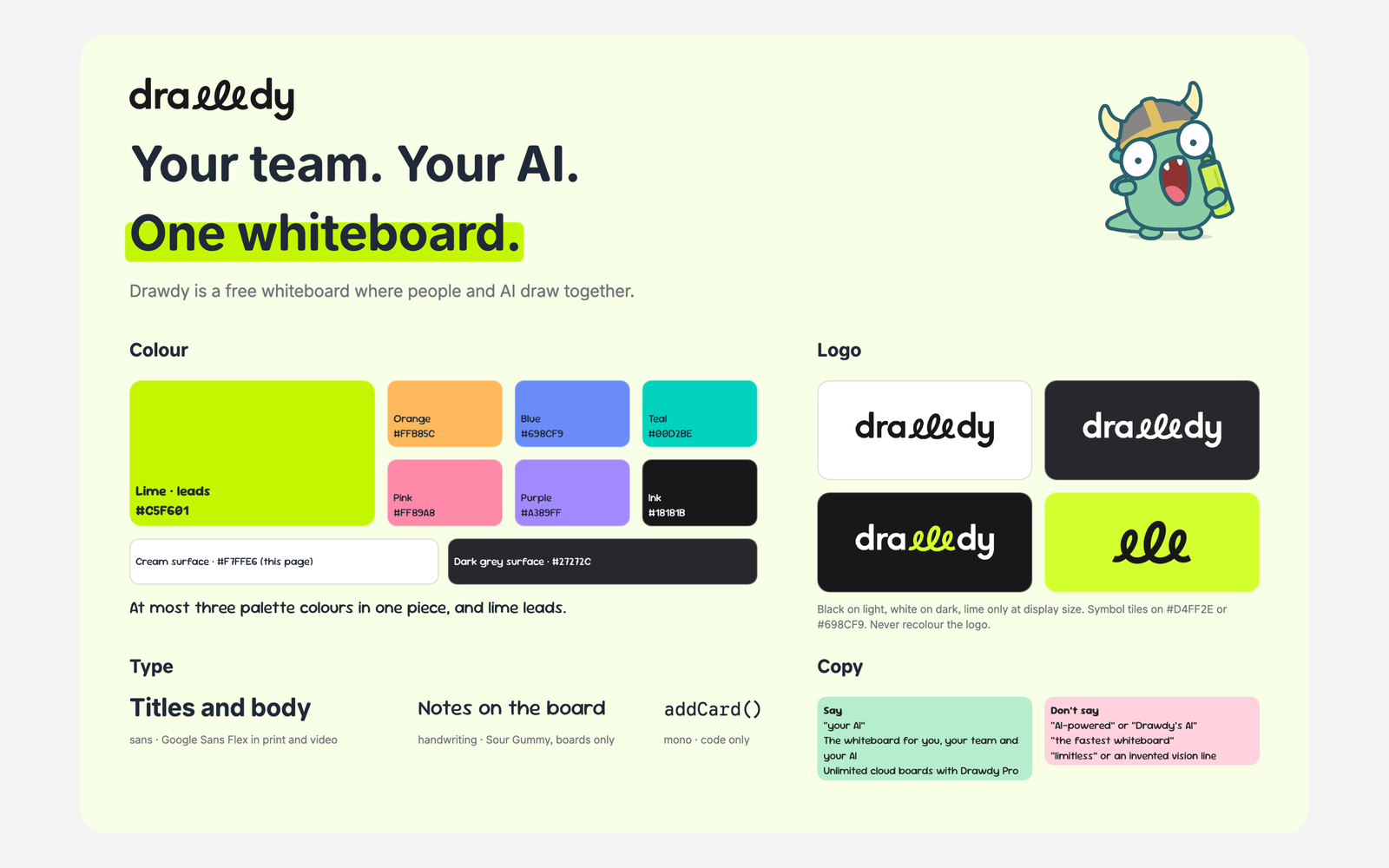
- wordmark-black.png on cream, white or any light colour (the default), wordmark-white.png on dark grey or dark photos, wordmark-lime-on-dark.png only on dark and only large (240 wide or more). Aspect 107 : 28, so a 214-wide wordmark is 56 tall.
- symbol-black.png (aspect 26 : 14) only where the name is nearby or in a square tile, and only on #D4FF2E or #698CF9.
- The wordmark is the first logo in a piece, at least 120 wide, with clear space of a seventh of its height on every side. Never recolour it, stretch it or put it on a pattern.
Colour
- Lime #C5F601 leads. Add at most two of orange #FFB85C, blue #698CF9, teal #00D2BE, pink #FF89A8, purple #A389FF: three palette colours per piece, never more.
- One mark means one idea; never two marks of the same colour for different things.
- Do not set text colours on dark-on-light text; the board keeps it readable. For sublines and captions use #71717A on light, #A1A1AA on dark.
Type
- Titles and body: fontFamily sans. Titles bold, sentence case, two or three short lines, big (48 to 72 for a page title, 24 for section heads, 16 to 22 for body).
- Handwritten notes drawn on the board: fontFamily handwriting (Sour Gummy), never for titles or UI.
- Code: fontFamily mono, only for code.
Motifs (pick one or none)
- Highlighter: a lime rect (cornerRadius 8) behind one key line, added before its text, covering the lower two thirds of the letters and overhanging the words by about 6 units on each side.
- Diny the mascot: image https://cdn.public.drawdy.io/images/skills/seed/drawdy-brand/assets/diny.png (aspect 960 : 850), at most one per piece, never covering text.
Copy
- Definition: "Drawdy is a free whiteboard where people and AI draw together." Tagline: "The whiteboard for you, your team and your AI". Hero line: "Your team. Your AI. One whiteboard."
- Say "your AI". Never "AI-powered", "Drawdy's AI", or an AI that watches or suggests on its own; a connected AI joins the board like a teammate.
- Pro: "Unlimited cloud boards with Drawdy Pro", with a 14-day free trial. Do not state the free plan's board count.
- Speed claims only as the public benchmark (10,000 elements: Drawdy 120 fps, Excalidraw 10, tldraw 11); never "the fastest whiteboard". Never say other whiteboards lack MCP. No "limitless", "open whiteboard", or invented vision or mission lines.
Steps
- Plan the piece: its one message, which two secondary colours (if any), and which motif.
- Add the surface, then highlighter rects, then logo and images, then text and shapes, in as few add_elements calls as you can.
- Run check_board on the area (render both) and fix overlaps; text on the cream or dark surface stays readable in both themes.